Sunday, December 30, 2012

Simon and Schuster: Alice in Wonderland and Lord of the Flies

Simon and Schuster is a publishing corporate for books in New York city. For this project, I had to redesign some book covers that were published by them. There were a total of 4 book covers that needs to be redesigned, but these are the best 2 of all 4.

Lord of the Flies - William Golding (Constructed)
For the Lord of the Flies book cover design, I decided to do the constructed technique. The book is about children living in the wild and civilization. The writing of the title is a construction of leaves, soil, rocks, and everything I could find that is related to nature. I even gave some dirty soil smudges on the background to give a dirty look. I tried to keep the color palette to green and brown because those colors are related with nature. My goal is to have a wild and dirty look book cover.


Alice in Wonderland - Lewis Carroll (Illuminated)
For this illumination piece, I decided to have mushrooms for my main focus. When I was doing my research on Alice in Wonderland, most of the pictures have mushrooms in the background. I also thought that mushrooms can be fun as they can have different colours and patterns. My goal is have a fantasy-looking, sweet, and complicated cover. The colors that I chose are pastels because those colors give a sense of sweetness and girliness to the piece. I added the brown frame so that the piece is not too wild or messy. It limits the audience’s point of view and help them focus on the title.


My Typography 2 class was definitely painful, but it was my most favorite class of my Fall 2012 term. I really appreciate Dale Gronso for all the strict grading and for treating all the students like professional Graphic Designers. After taking his class, I feel so productive because all of the workload every week is around 12-20 hours, but I learned so much from this class. Definitely was the most challenging because we were not allowed to use computer to create our visual on this class, there was a lot of sketching and roughs. No regrets!

Saturday, December 15, 2012

Teapot Candles: From Grandma, With Love

"I'M FREE FROM EXAMS!"

All my hard work and studies finally paid off. It's December and colder days are coming!

My digital illustration class is finally over :( I really enjoy this class because I feel so productive during this past 3 months. My instructor, David Hohn has done a really great job in assigning projects, I LOVE THEM ALL!

This is my final project and I was suppose to design a candle box. My brand is Teapot Candles because I was obsessed with silhouettes of teapots during this past few weeks, not even sure why. I just thought teapots are cute. From the start of this project, I knew that I wanted to do something very authentic or "family style".

"Every Christmas, our grandma always visits us back home in Asia and brought home scented candles to burn in our homes. The word ‘Teapot’ is inspired by our lovely granny’s hobby, drinking Chinese tea from her favorite ceramic teapot. Every afternoon, she would drink her tea while enjoying the smell from the burning scented candle.


It has been a tradition since the grandchildren were young, and it was heart-warming for us to have such lovely granny. We would like to share this tradition with you. Most of the scents we sell are our grandma’s favorites. We hope that these candles will bring you closer with your loved ones just like it does for us." 


FRONT

FRONT WITH FLAP

HAND-STITCHED FRONT LOGO

HAND-STITCHED BACK


TAG ADDITION
BACK WITH TAG

CANDLE

LABEL ON CANDLE

BOX AND CANDLE


It definitely was a fun project :D

Thursday, November 8, 2012

Cooking Club Organization Logo

It's been quite a hectic week for me, especially all the things happening after midterm. More projects assigned, more time spent on Illustrator, and catching due dates. After the Jayesslee Poster, my instructor assigned another 2-week project. The objective is:
Create a logo for an organization. The team may be any athletic or activity based club but is must be a realistic and substantial category that has a possible national representation (ie: sailing, sewing, literature, jogging, biking, film groups, chess, craftmakers, arts union, etc). Focus on the imagery and execution, and keep the name and readability clear and simple.

I decided to focus on a cooking club focusing on Italian food called "Bon Appetit".


Wednesday, October 17, 2012

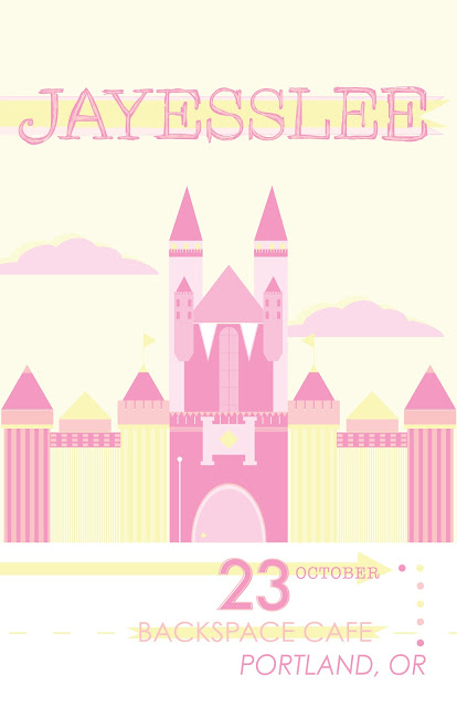
Jayesslee Poster

Week 3: Digital Illustration

This is a 2-week and 3-color project. We had to pick whoever band/singer we want to design the poster for. I picked Jayesslee because they're my favorite duet. They are korean twins named Janice and Sonia Lee, they are in their 20s.

I wish they'll come to Portland for real, the date and venue aren't real

Three colors & Hues

Picture reference


Draft

I submitted my 'final draft' and my teacher gave us all another week to revise our reviewed piece. Here's my real final piece...


11x17 mounted on 15x20 black matte board

This poster made it to the school display wall! :)

Wednesday, October 10, 2012

Typography 2

Fall is here and here goes Typography 2. This is probably the busiest class I had to take in the history of Bachelor of Graphic Design. For the first class, I got like around 5 homeworks assigned. Good thing I liked the classes, so it was not as painful.

The first assignment is to draw letterforms: Sans Serif, Old Style, Transitional, Modern, and Black Letter. I had to draw a D because for the theme for my final typeface I'll be making is "Dream Catcher".


Monday, October 1, 2012

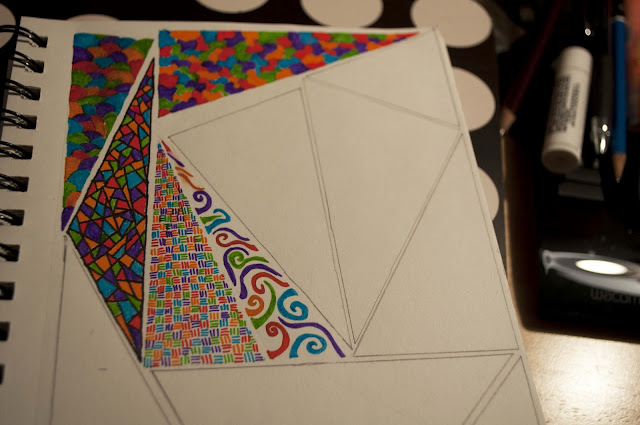
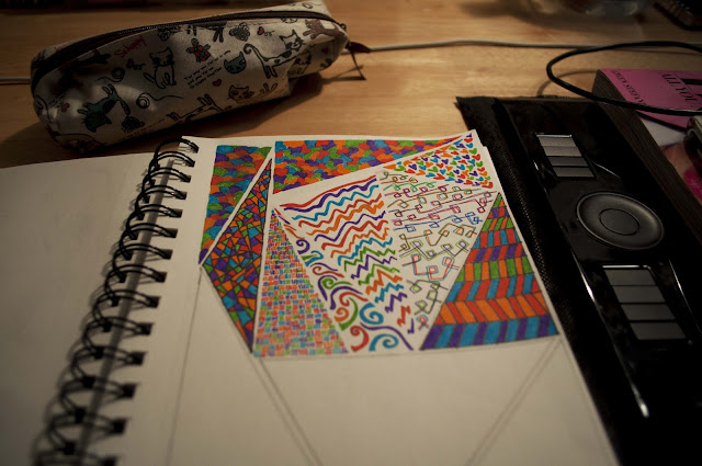
Patterned Triangles

Exactly 1 week before school starts, I decided to make myself busy by assigning a project to myself. I am obsessed with patterns and triangles and was wondering why not I make something by combining those two.